|
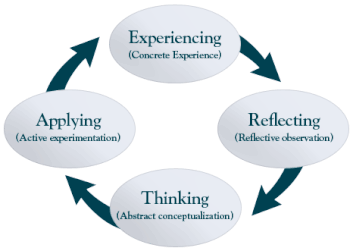
If you're like me you've seen a lot of infographics about learning in your professional life. Yes, a picture is worth a thousands words and a visual often lends clarity to an idea expressed in words. However, one thing I have noticed is how many times we equate learning to a cyclical pattern. It's an idea that has never sat quite right with me. In recent years there has become a great acceptance around the idea that learning is messy. We've embraced mistakes as learning opportunities and removed the notion that learning was meant to be done with the teacher at the front of the classroom, students in rows and the sound of silence filling the moments when the teacher wasn't talking. My question is if learning is so messy, how come we still put together such neat, uni-directional flowcharts and graphics to describe the learning process? Why do we embrace the idea that a cycle or flow-chart with arrows only pointing in one direction is a true representation of learning design and implementation? I think the learning process and learning design is much closer to a scatter plot than a cycle or flow-chart. Why? Because the needs of every learner are different. Their experiences and prior knowledge are different. The rate at which they will learn information not only varies from student to student, but from topic to topic and subject to subject within each individual student. You see, in learning we have to be prepared to be at any point at any given time. We also have to be prepared to move to a different point on a moments notice. That movement may go against the flow of your standard cyclical process, it might go with the flow, it might jump to a point further away or even to a point that wasn't even originally on the continuum in the first place. Learning is messy. Learning design and execution are messy, and that's exactly what makes them learning experiences. Learning is...
0 Comments
Leave a Reply. |
AuthorJeff Lahey Archives
January 2020
Categories
All
|

 RSS Feed
